CASE STUDY
Manor Farm Park & Woodlands
Located in 25 acres of countryside on the border between Nottinghamshire and Leicestershire, Manor Farm Park & Woodlands is a great family-friendly day out.
Located in 25 acres of countryside on the border between Nottinghamshire and Leicestershire, Manor Farm Park & Woodlands is a great family-friendly day out.
When they approached us looking for a new website we knew that it was crucial to ensure that the family appeal would shine through for any potential visitors and quickly set about making this happen.
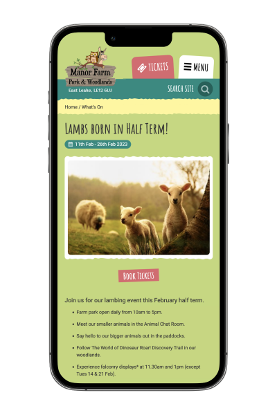
Our primary focus in designing and building the new website was on a new targeted navigation, with an emphasis on upcoming events and farm activities. With a fun and friendly feel which reflected the farm’s values it made the website far more accessible and useful for visitors and made sure that Manor Farm’s staff could promote the activities which they were working so hard on.
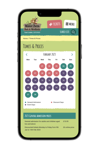
As an addition to this, we enhanced the existing ‘Today’s Activities’ module to allow the farm team to create custom activity lists for different days of the week, as well as setting up activity schedules in advance for any school or bank holidays. This helped to dramatically cut down on the time spent loading in individual activities and meant that the farm could be ahead of the game for holidays instead of frantically updating the site on the week of the event! Customers really benefitted too, with the ability to plan their visit around events which they were interested in and to avoid missing specific activities.
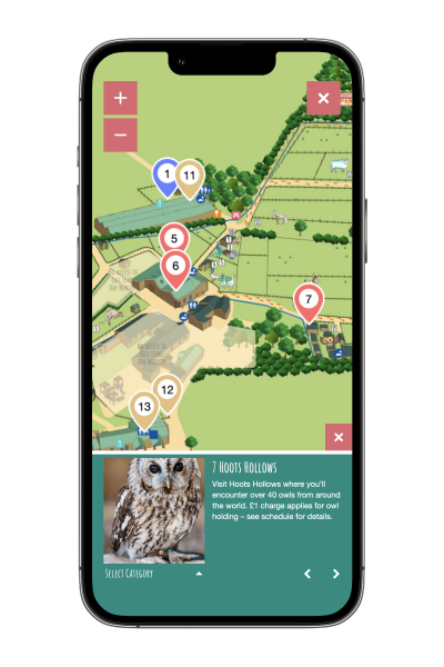
Another key element of the new site was the interactive map, which has proved incredibly popular; an overview of the farm with key points marked, potential visitors can select individual points on the map and read up on them, allowing them to get a real feel for the farm before their visit and to ensure that they don’t miss anything.
Throughout the design and build process mobile functionality remained at the forefront of our minds; with more people using their phones for internet browsing than ever before we knew that this would be a key element in ensuring the usability of the new site. Every element was rigorously tested on a variety of different screen sizes, with a seamless transition between different devices held as a priority. Page elements move around the screen depending on the device to make the best use of the screen available and the user experience is considered at every step to maintain the friendly and intuitive feel.


