CASE STUDY

Tulleys Shocktober Fest

Repeatedly crowned the UK’s No. 1 Halloween Attraction, Tulleys Shocktober Fest needs no introduction; the incredible live attractions, committed actors, and huge visitor numbers speak for themselves.

We’ve been working with the Tulleys team since 2012, building and maintaining their collection of websites, and helping them to promote their various attractions to the widest possible audience. The Shocktober Fest site is one of our favourites, though; it’s gradually been updated over the years and has great features throughout.
Frighteningly Familiar

The main strength of the Shocktober Fest site, somewhat unintuitively, is in its similarity to the other Tulleys pages. Although each of the farm’s different ventures can be regarded as standalone businesses in their own right it’s always been a key aim to maintain some continuity between the websites to remind visitors that they are still linked. Managing that while still allowing for individuality has taken some doing, but we’re very pleased with the end result.
 
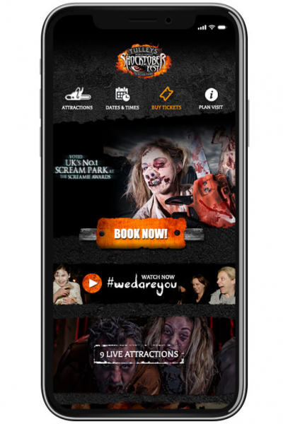
The primary similarity between the different sites is in the header. The general layout has remained the same across all of the websites, with the logo on the left and main menu items on the right, with additional options listed above. The tractor icon doesn’t turn into a chainsaw on hover on the regular farm site, surprisingly, but otherwise it’s pretty similar! The general page layout is subtly familiar as you move between sites, too, albeit also with wildly differing content.

Tulleys Shocktober Fest

Creepily Comprehensive

The site also brings a comprehensive feature set which helps to reduce the admin time required by the Tulleys team in order to keep it up to date. The dynamic ticket promotions module allows easy management of the early bird ticket releases which take place throughout the year by allowing the team to set-up date ranges when offers will be automatically implemented to allow customers to view accurate ticket prices without the admin team needing to frantically update everything at the exact right time.
 
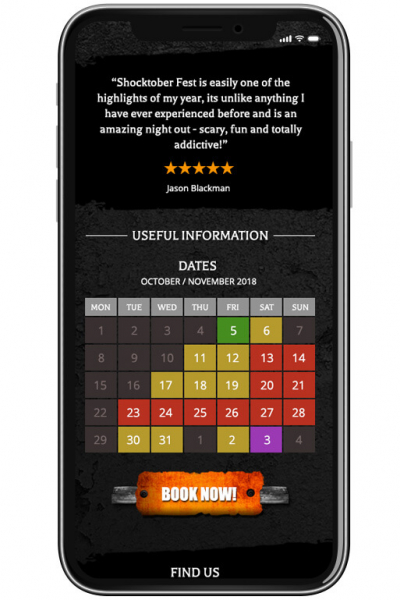
The calendar and opening time features are also invaluable in reducing the number of duplicate questions directed at the Tulleys team. With all of the opening dates, times for each day, and any special events all clearly highlighted, and additional information available on click as well as direct links through to buy tickets when available this has proved very popular with both staff and customers alike.

Alarmingly Long-term

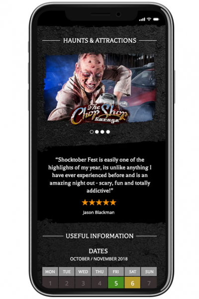
The site is rounded off by the powerful graphics throughout, not to mention the blood-curdling descriptions of the assorted haunts, and we’re very proud both of it and of the impact it has been able to have. As Shocktober Fest itself keeps growing so too will the site, and we’re excited to be with it every step of the way.

View Website
81/100
Google Page Speed
10%
Revenue
71%
Mobile Traffic

(Comparing Oct 2017 with Oct 2018)

Previous Case Study

Manor Farm Park & Woodlands

Next Case Study

Squirrel's Scramble

Got a project in mind?