CASE STUDY

Clip ‘n Climb Chelsea

Clip ‘n Climb Chelsea is an indoor climbing centre in the heart of London; using automatic belaying devices to allow all levels of climber to take part it has helped to make climbing accessible to the general public, promoting having fun and keeping fit!

Having already built the website for Clip ‘n Climb’s sister business, Chel-Ski, we were delighted to be asked to create a fun and dynamic new site for the climbing centre.

GETTING INTO SHAPE

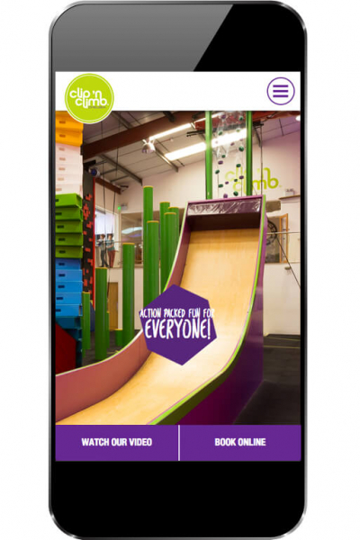
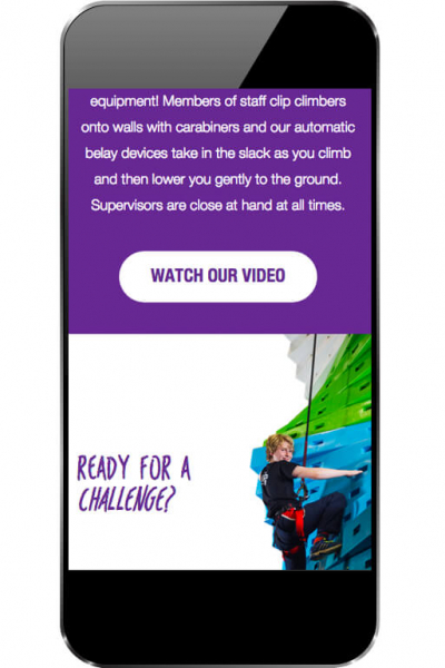
While Clip ‘n Climb’s offering was fresh and innovative their existing website was not. We worked with the team there to create a new offering based on their brand guidelines, bringing a fresh and playful feel in order to appeal to their two key audiences; parties and corporate events. With interactive elements throughout the site, bright and engaging colour usage, and striking page layouts we were able to really showcase the Clip ‘n Climb experience to show customers what to expect.

As part of this, we also pushed the customer flow toward booking a session online rather than hoping for a space on the day, driving sales revenue and making the process far easier for the customer through a carefully planned journey.

Clip N Climb
Clip N Climb
Clip N Climb

STARTING FROM A SOLID BASE

With the Clip ‘n Climb focus firmly on the customer experience, it was important that the team there had access to a simple CMS system which would do what they needed without distracting them from other priorities. We were able to answer this by providing our intuitive CMS platform, tailored to Clip ‘n Climb’s needed to allow speedy site updates and management from one central portal which could be accessed from any device, to allow the team to concentrate on their customers.

REACHING NEW HEIGHTS

With the new website welcomed by customers and staff alike and the updated and engaging interface helping to encourage new visitors to try out climbing for themselves Clip ‘n Climb are going from strength to strength and we’re proud to continue supporting them!

We were thrilled that Website Vision was available to do the re-design and re-development for us, and once again it was a great experience working with them throughout the project. The transition from a tired and lacklustre website to one that is inviting and easy to navigate round has put a smile on all our faces.

We now have two websites that not only look great but allow us to share great content (copy, images and video) with our customers. Although the CMS is very intuitive, the Website Vision team are just a phone call away if we get stuck trying to upload something, which is very reassuring. Heartfelt thanks from us all.

Rachel Goldberg
Marketing Manager - Clip 'n Climb Chelsea

VIEW WEBSITE
Previous Case Study

BIAZA

Next Case Study

Shakespeare's Schoolroom & Guildhall

Got a project in mind?