CASE STUDY

Flambards

With an aircraft museum, authentic Victorian village, and family theme park, it’s fair to say that Flambards really does have something for everyone.

We worked with the team there and their marketing company to create a website which meets just as wide a range of needs.

INTEGRATION, INTEGRATION, INTEGRATION

As an attraction, encouraging pre-visit ticket sales is particularly important for Flambards, so a key part of the site build was ensuring a seamless integration with their online ticketing provider. To achieve this we created a dynamic calendar on the website with colour coding to show customers which attractions were open each day. With direct links from the different days through to the relevant ticket purchase page, this has helped to streamline the process for customers while providing all of the relevant information at a glance.

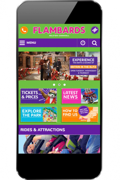
We also needed to integrate Flambards’ colourful and engaging branding, working closely with the graphic design agency who had created it to ensure that that site remained true to the Flambards message and brand. We think it looks pretty good, if we do say so ourselves!

NAVIGATION OPTIMISATION

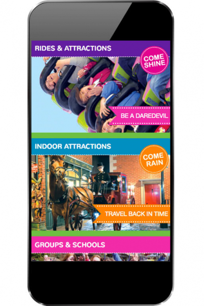
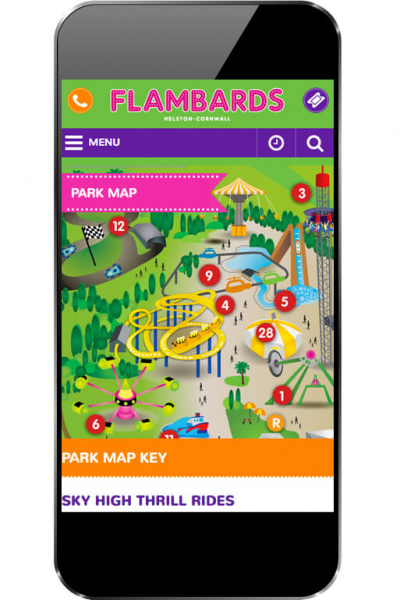
With so many different attractions the site needed to be able to show visitors the variety which was available to them clearly and succinctly. As well as breaking the attractions down into groups to allow customers to find what they were looking for more easily we also introduced an interactive map to help with day planning; with each attraction carefully labelled customers can learn more about each option and plan their route through the park. Carefully optimised for mobile use as well, visitors can also use the map to find their way around while on site

Flambards Theme Park
Flambards
Flambards Theme Park

GOING MOBILE

The map wasn’t the only element of the site which needed to be optimised for mobile; having monitored the analytics for Flambards’ existing site we were aware of the high proportion of customers who were browsing on mobile devices rather than desktop or tablet and made sure that the entire site was built accordingly to cater for this. Throughout the build, we tested extensively across a range of devices and platforms to make sure that customers would all have the same optimised browsing experience.

HAPPY CUSTOMERS

With the site now live we’ve been delighted to see customer engagement going strong and the Flambards team enjoying their new, easy to navigate website!

"Working alongside graphic design company Absolute, Website Vision were able to take the major rebrand of Flambard’s Theme Park and produce a new fully responsive website, which is easy to navigate, clear and concise while being bright and fun! Their powerful and flexible CMS platform has allowed us to manage our website on a daily basis and with the integrated opening times calendar it has made booking tickets online quick and easy for our visitors.

We would highly recommend Website Vision to any other business in the attraction and leisure industry who want an efficient and professional website."

Nikki Smith
Flamingo Marketing

VIEW WEBSITE
Previous Case Study

Tulleys Escape Rooms & Games

Next Case Study

Murder 57

Got a project in mind?