CASE STUDY

Lightwater Valley

We were delighted to work with them again to provide a first-class website that would engage, enthuse and educate their customers whilst boosting ticket conversions.

As Lightwater Valley had recently launched significantly new branding, they required a redesign and revamp of their website to provide clear consistency across all of their online platforms.


Rebrand and Refresh

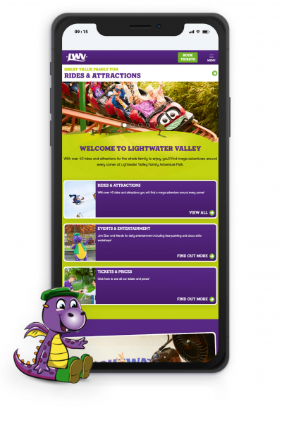
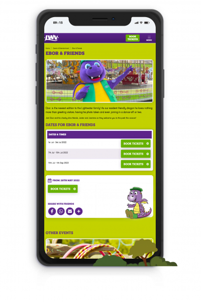
The team at Lightwater wanted to update their website so that customers could capture the essence of their attraction right from the start of their booking journey. We worked with them to make sure that the branding, imagery, and site were all developed in line with one another, creating a seamless booking experience that reflected their values.

By upgrading their website, they gained access to the most up-to-date CMS platform, giving them additional features and the flexibility to make changes and upgrades to their site. Lightwater wanted to focus on a simple and easy booking system for their customers, and by upgrading their website they could access interactive modules that could provide a quick purchase method for their visitors.


Entertaining New Features

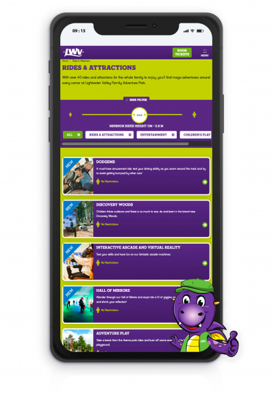
Using our latest CMS platform meant that the Lightwater team gained access to the Rides and Attractions module. As the customer journey was of main importance, the rides and attractions feature has been set up to supply detailed information on each ride at the park, providing height restrictions and details of when the ride is open. This allows flexibility throughout the season and can be easily updated if any mechanical issues arise, giving customers the information they need to make an informed decision when booking.

Light Water Valley
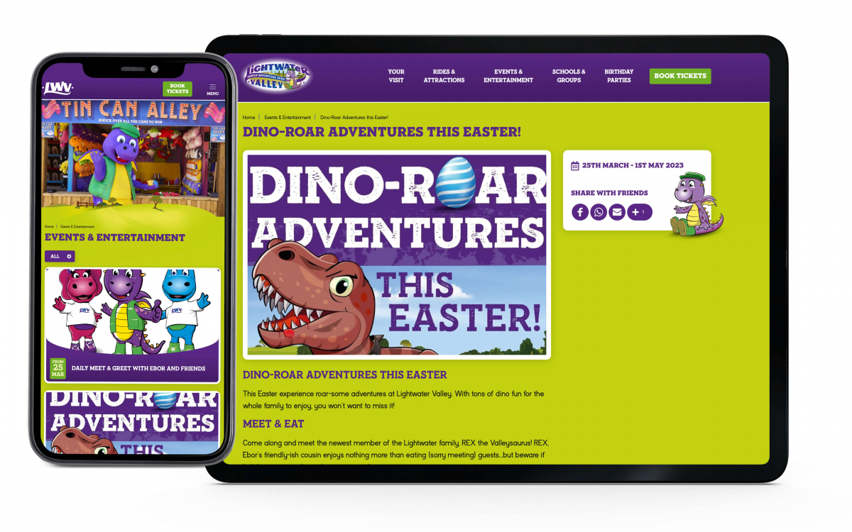
Lightwater Valley Mobile View
Light Water Valley


Trails and Turns

Another new feature that Lightwater wanted to explore was our interactive map module, which provides the customer with an access-all-areas experience before arriving.

Park attractions, locations, and information can be uploaded, providing the customer with an onsite feel from the comfort of their own home, and ensuring that they make the most of their visit and feel at ease finding their way around once at the park.


media


A Ticket to An Adventure

To be able to provide the best user experience, Lightwater has also opted to use our Opening Times and Calendar module. This gives them the flexibility to show the days they are open, highlight special events, or during the off-season to simply alert customers to the fact that the park is closed. Using our sister company DigiTickets, we have also integrated their ticketing platform with the calendar, letting the customer click on a date and be taken through to the booking page immediately, saving time and confusion and boosting conversion rates. Having worked in the attractions industry for many years we’re well aware that the booking process needs to be handled in the smoothest possible way. We’re constantly tracking consumer habits and booking trends to keep the number of clicks to a minimum and to keep improving our designs to improve the customer experience.


View Website
Previous Case Study

Tulleys Christmas

Next Case Study

The Lynton & Barnstaple Railway

Got a project in mind?