CASE STUDY

The Milky Way

The Milky Way Adventure Park is a popular family-friendly visitor attraction in North Devon, located between Bideford and Bude, near Clovelly.

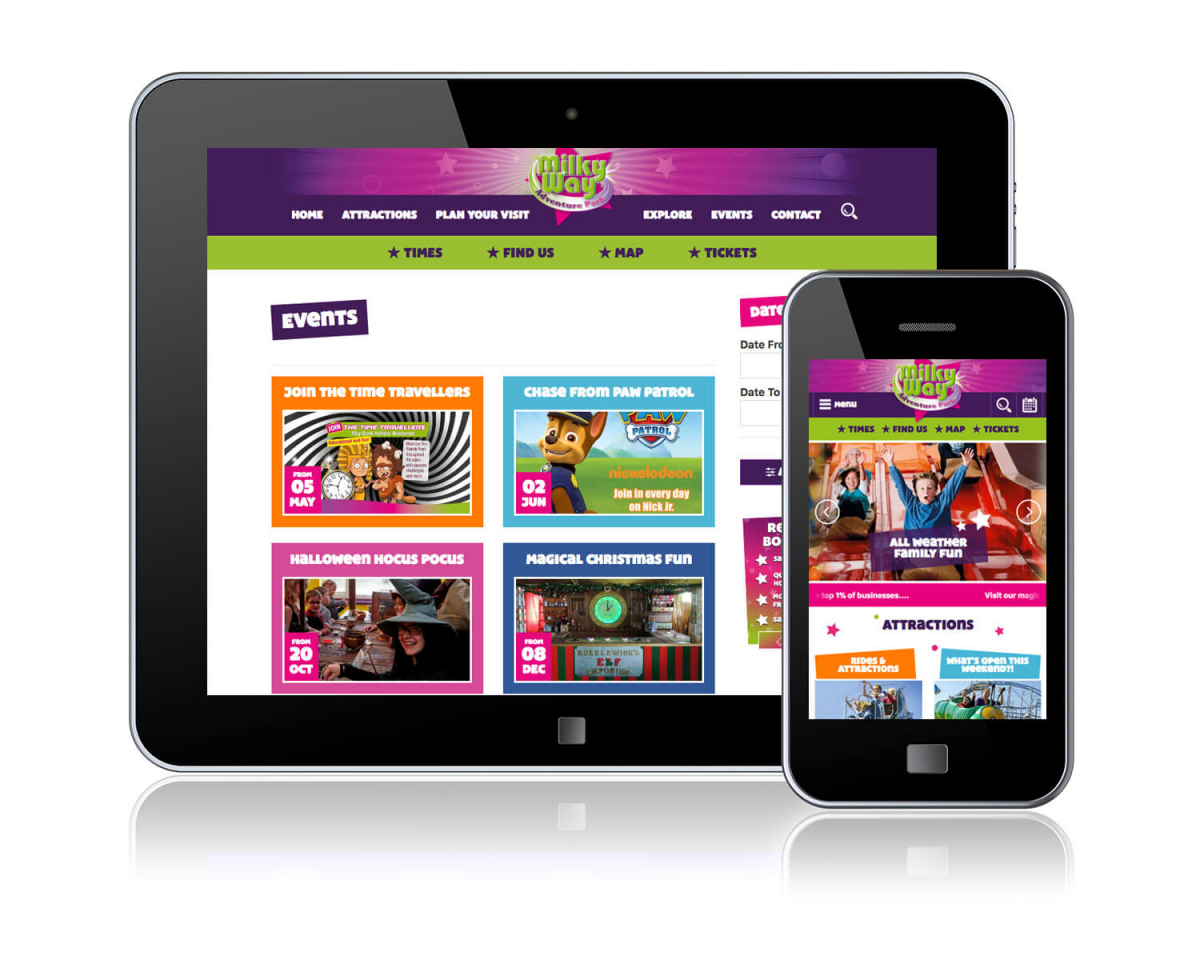
We’ve worked with them to build a new, easy to manage website, allowing ease of use for customers and staff alike.

New Requirements

The Milky Way’s primary requirement was for an intuitive CMS to allow them to quickly and easily update the site to ensure that customers had access to the latest news and events, as well as fluctuating opening times and prices. They were also working with a graphic design agency to refresh their brand, and this needed to be carefully integrated into the website in order to reflect their new look and feel.

In addition to this, the new website needed to be easily accessible for customers on mobile devices while keeping page load times fast and overall impact high to engage casual browsers and encourage them to visit.

VIEW WEBSITE

Tried and Tested Solutions

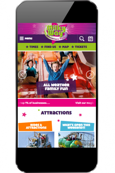
Our established CMS platform, gradually developed over time to match client needs, proved the perfect solution; built with a mobile-first approach, to ensure that the customer experience was just as strong whether viewing on a desktop or mobile, the new site highlights information which customers might need while reflecting the colourful and playful new branding with bold angles, textures, and animations.

The site also seamlessly incorporates ticketing links into the customer journey, carefully positioning them to encourage conversion and to make the transition consistent so that customers hardly notice they’ve switched sites. The intuitive CMS allows the Milky Way team to update elements quickly as needed too, to maintain the site in keeping with the attraction at all times.

The Milky Way Adventure Park

Interactive Map

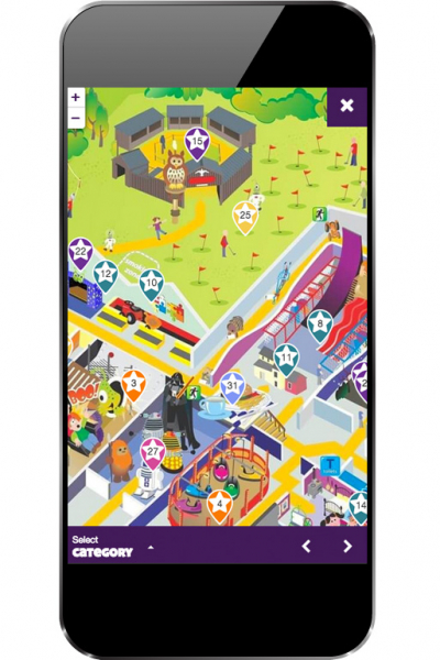
Analysing the Milky Way’s previous website it was clear that their existing site map was receiving a lot of traffic from mobile devices, which seemed likely to be from park visitors using it to find their way around while on site.

This highlighted the importance of making the map both accurate and easy to use across a range of devices; using this information we built a bespoke module to allow visitors to view and read up on the different elements of the attraction.

Visitors can browse the map as a whole, or select individual attractions and see additional information about them, while staff can customise it through the CMS, dragging and dropping the markers and colour coding by category as necessary.

Fully Responsive

Colour-Coded Calendar

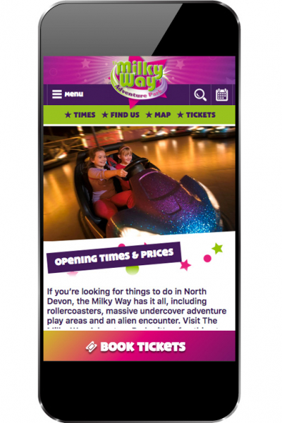
With different opening times and prices depending on the day and time of year the park also needed a clear way of communicating this to customers so that they could plan their visits accordingly.

To meet this need we designed an updated calendar which could both display the current month on the homepage and a full year overview on the dedicated calendar screen.

With customisable colour coding for different date types and a pop-up key so that customers can check the details for their chosen dates it has proved very popular and has made the admin load considerably lighter!

View Website
63%
Mobile Traffic
135%
Revenue
8.7k
Pageviews

(Comparing Mar 2017 with Mar 2018)

Previous Case Study

East Somerset Railway

Next Case Study

Seaton Tramway

Got a project in mind?