CASE STUDY

Torquay Museum

Placed within the English Riviera, Torquay Museum approached Website Vision to give their website a contemporary and updated feel to bring their exhibitions to life.

Having recently introduced new branding, Torquay Museum contacted the Website Vision team to implement this on their website, bringing new life to their online presence. Using our bespoke platform to create pages for their exhibitions, we were able to work together to really show the true beauty of all the collections within the museum.

Going Mobile

A very common requirement for new customers coming on board, is to ensure their website is fully mobile-optimised. Our research shows that the majority of visitors to a website access the site through their phone, so our design team focus on a mobile-first approach when starting a project.

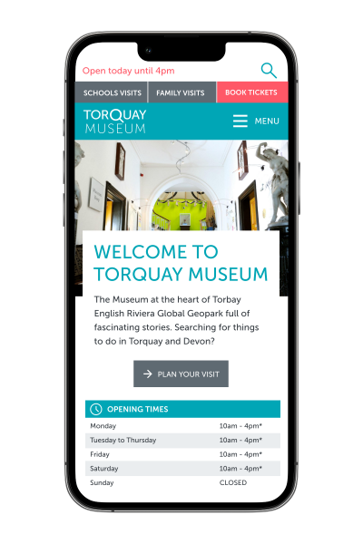
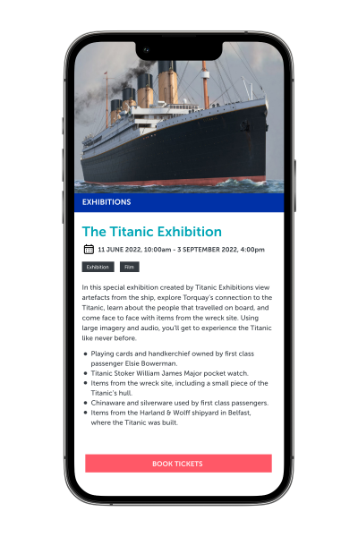
This was no different for Torquay Museum. They really wanted to focus on having a clear and simple design for mobile users, to ensure that they could access all of the information anyone browsing on a desktop would have. This meant optimising menu options and displaying clear opening times, as well as providing a call to action button for customers to prebook their tickets.

Torquay Museum Mobile View

Welcome To The Museum!

Of course every attraction aims to create a welcoming environment and Torquay Museum wanted to ensure this was felt both online and in person. Our in-house designers worked with the team at the museum to display beautiful large imagery to really encapsulate the feeling of the museum. Using bright and interesting images alongside their clear-cut colour palette, we were able to create pages that drew the eye in and would excite potential visitors.  

Page Simplicity

As part of bringing the museum to the screen, the team at Torquay Museum wanted to be able to offer visitors access to all areas in the comfort of their own home. Here at Website Vision, we provided advice and guidance on the best way to display menu options and the hierarchy of pages to provide an easy flow for the customer journey without overcrowding their options.

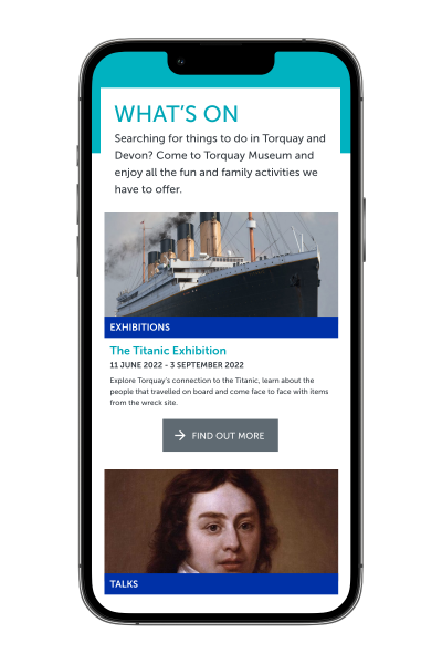
Torquay Museum have a plethora of exhibitions and information to provide and we wanted to use the best modules to display this. Using our CMS modules, our design team created simple landing pages to direct the customer to their desired page efficiently, using panels and page blocks. To make navigation simple for their WhatsOn page, we incorporated a filter function so the customer can easily find the event they are looking for.

Exhibiting the Results

Our team had a great time working alongside Torquay Museum, and even if we do say so ourselves, we think the site looks stunning! Providing a functioning and easy to use CMS has given the team at the museum so much more flexibility, and we look forward to seeing their future updates! 

View Website
Previous Case Study

The Lynton & Barnstaple Railway

Next Case Study

Buttercups Sanctuary for Goats

Got a project in mind?